Icons for Austin Parks & Rec
Constructing a revised icon set for Austin Parks & Recs’ complex sustainability stories through rigorous iterations and targeted user testing.
Role:
Visual Designer
Duration:
Jan. 2026 - Apr. 2026
Guided By:
Jon Freach
Team:
Ava Hale, Reyana Tran, Vianey Nicole
In our team of four, I worked towards creating a plan for prototyping, testing and refining our icon set through user feedback and clues. Collectively we ideated and rigorously sketched to produce 150+ versions in total of all icons, each change backed by real insight through the perception of Austin park goers.
Jon Freach and the rest of the cohort provided us with resources, crucial critique and encouragement to maintain the fiery moment throughout the project.
The icon design team, a group of 4 among the 14 member ensemble at wkrm studios, created a refined set of 23 icons that simplified abstract sustainability terms to visible & learnable symbols for Austin park visitors. Wkrm [link] is a student-run, faculty-led design studio housed at the Department of Fine Arts building at the University of Texas at Austin.
Opportunity
Austin Parks & Recreation came to us with a problem: their sustainability stories were going unnoticed.
Park goers were unable to identify the purpose of these signs, there were missed storytelling opportunities and operational issues caused by inconsistent/missing signage. We identified points of frustration through inquiry, and realized an imbalance in the type of content displayed, the signage form and locating the information in parks.
Recognizing four important questions, how might we tell complex sustainability stories to increase visibility and action among park goers by addressing what these stories look like, how they’re told, how they’re interacted with and where they live.
Research
The Sustainable SITES initiative promotes the creation of sustainable built landscapes, and the rating system helps conserve, restore and create the benefits provided by healthy ecosystems.
We dove into aspects that could help get closer to achieving this rating for the city of Austin Parks and Recreation, by addressing the promotion of sustainability awareness and education section for the certification. Further inquiring into the specifications, we determined educational/interpretive signage and digital touchpoints to be the deliverables for the project in order to comply with requirements of this certification.

The Icon Design team, as the first point of interaction, addressed the “What do these sustainability stories look like?” question. Our Fall’25 peers started this process by designing the first iteration of 14 icons, providing us with a framework for visual style and guidelines. However, these icons were not taken out of the context of wkrm studios and lacked feedback from users.
Solution
Audit the existing system, diverge first and then cut outliers, conduct tests in outdoor environments for real feedback and finally create a feedback loop for critical design decisions.
Our solution involved two key aspects to kickstart our process:
Conduct usability tests for current + new icons:
We were provided with an icon system, and it was important to establish the perception of these icons with our targeted users prior to moving ahead with designing new icons. We sent out an online survey with the existing icons, as-is, and received 33 pivotal responses that shaped our approach to the next steps. To tackle testing the newer icons, we devised prototypes for 3 testing plans, each accommodating the setting (Austin parks), the users (Austin park goers) and the nature of the test (game-like, intuitive).
Research & identify working aspects of popular icon systems:
To back our user research, we wanted to focus on elements that worked for other popular icon systems and borrow those principles for our design process. Modern icon design has roots in Olympic pictograms, and we were particularly inspired by the pictograms from the Mexico City 1968 Olympics due to its simplicity and ability to convey sports with minimal context clues.


Our online survey yielded insight to begin working on the established system, and we were able to identify areas of improvement fairly quickly through this process. Simultaneously, we approached the additions to the existing set of 14 icons with multiple iterations of the newer complex concepts to understand what resonated best with representing these terms.
Prioritizing quantity for outcome, through the process of elimination during critique sessions, we were able to refine and develop icons that fit into the identity. This was iteration 1, the first concrete evidence of the new set of 23 icons.
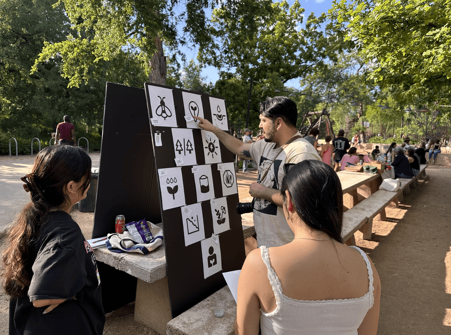
The next steps involved creating a concrete plan for testing and taking iteration 1 of the icons out into the parks for testing. For the testing plan outline, we identified that receiving feedback on 23 icons could pose a task if each icon was addressed individually and in depth. For that reason, we decided that it would make sense to conduct strategic games that involved a matching game mechanic. An example of this outline, which was used for testing: A matching game, placing all icons from iteration 1 on a board and having a park-goer play a quick 5-min round of assigning the respective words to their icon, then having a review session with follow-up questions.
Prototype + Result
Documenting real time feedback by taking the icons out for a walk in the park, we recognized recurring points of observations for particular icons.
For example; our ‘Snag’ icon was described to be very unlike a tree stump, and we even received ‘wet paper towel roll’ as a common observation among the park-going test group. Insight like this helped us identify areas of improvement fairly quickly, and work towards sharpening the details that pulled the visual together. For the Snag example, we added lines to resemble the texture of a tree stump, and create a more organic form with imperfections on the structure.
Our prototyping process was iterative. We focused on moving with the crowd-majority, taking recurring feedback into consideration while making changes. To strengthen these decisions, the rest of wkrm studios helped organize critique sessions during and at the end of workdays to provide detail/design oriented feedback that tied the final pieces together.
The final deliverable was a 23-icon system plus a usage framework: a shared grid, consistent line-weight rules, and mapping guidelines for how icons translate onto physical park signage.
The grid system and rules were established by the previous cohort, but elaborated by ours for expanding upon the current system and accommodating new sustainability concepts. The final set was displayed through a presentation for our stakeholders, Austin Parks & Rec, and handed-off at the end of the semester-long project with wkrm Studios.


" height="128.00004309501043px" id="Zg9ikXZGV" width="626.9159027103601px"/></g></svg>)